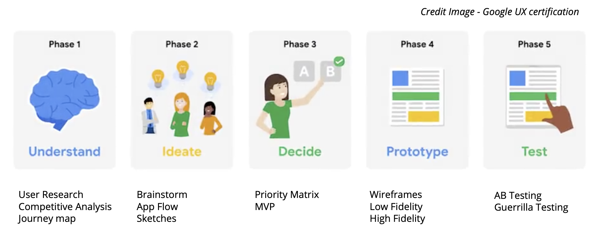
A new invisible service hotel is opening in Washington D.C. An invisible service hotel provides many of the amenities of a modern luxury hotel, but without a front desk or onsite staff. From check-in to check-out, consider how technologies can provide concierge-level services that are traditionally handled by a hotel staff.
The Solution
Enhancing the guest hotel experience from check-in/check-out and open hotel room with digital without to rely on any hotel staff in clear seamless manner for anyone through technology
I wanted to understand how people proceed to search for a personal coach or any services. These observations would allow me to understand user behavior patterns such as the steps taken to complete certain tasks.
From there, I wanted to understand how the search, decision, and check-in process could address common pain points and enhance the experience as a whole.
Defining what are the short- and long-term business goals?
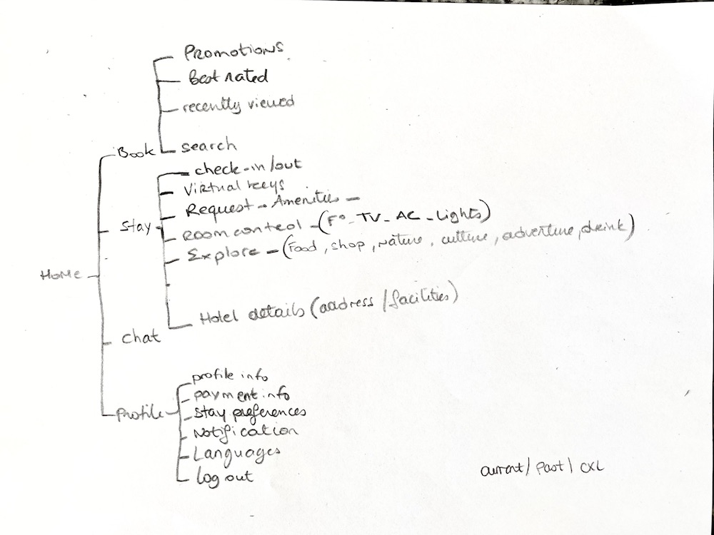
Understanding users patterns when checking in hotels
Tailoring their stay and their preferences
Determining design & features our application needs in order to help people quickly check in/out
Understand who our users are and find out what pain points they face when staying at hotels or Airbnb.
Research Methods
Industry and Market Research
Brief Interviews
Competitor Analysis: App Store, google reviews, Facebook
User Journey Map
Industry & Market Research
Hotels like any companies are looking to optimize their revenue. In this hospitality industry you mostly do so by improving guest service experience. How technology can help increase guest service of an invisible hotel?
94% of business travelers and 80% of leisure travelers value the ability to use their smartphones to request service and message hotel staff. (Oracle, 2017)
70% of millennials are likely to book holiday accommodation using a tech amenity like mobile payments, Smart TVs, or keyless entry. (PwC, 2019)
Hotels that are using virtual tours are getting up to a 135% increase in online revenue. (PwC, 2019)
US hotel gross bookings revenue in 2017 was $185 billion. (Deloitte, 2019)
user insights
“When I need to go somewhere to pick up the keys, it can be very annoying after a long trip”
Anais - Project Manager
“Not having everything that feels like home is frustrating”
Andrew - Engineer
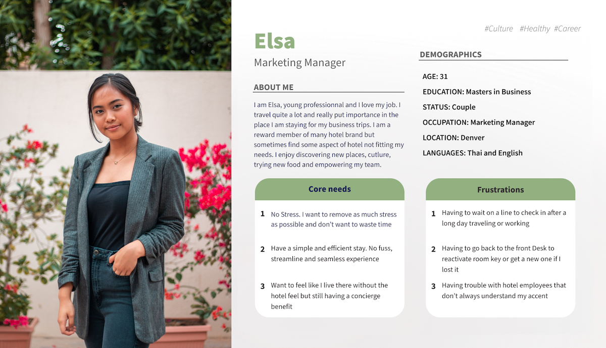
Building empathy: User Persona
The user research really helps me to narrow in on what my ideal user would look like. Elsa is a busy working woman and absolutely love her job. She has a fast paced lifestyle and when traveling she needs to get to her hotel room quickly. She does not want to wait in line or have issue with her room key.
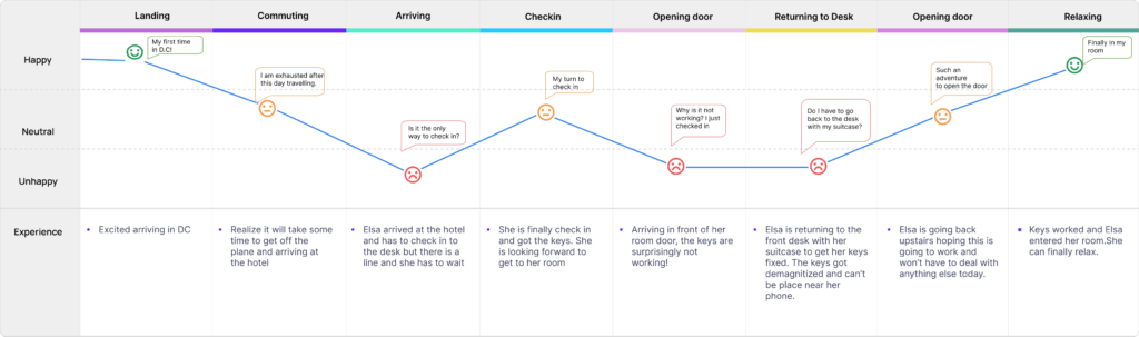
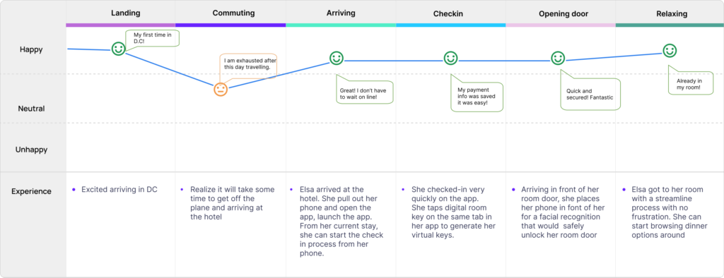
JOURNEY MAP
By analyzing the persona’s thoughts and emotions at each phase, I put together a journey map. It is a strong UX tool that really shows the userneeds and business opportunities and helps rationalize my design decisions.
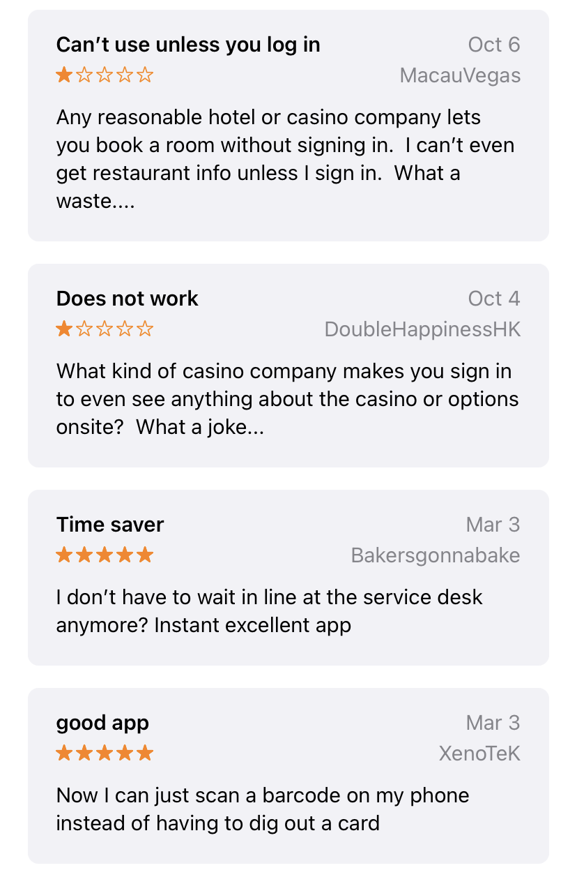
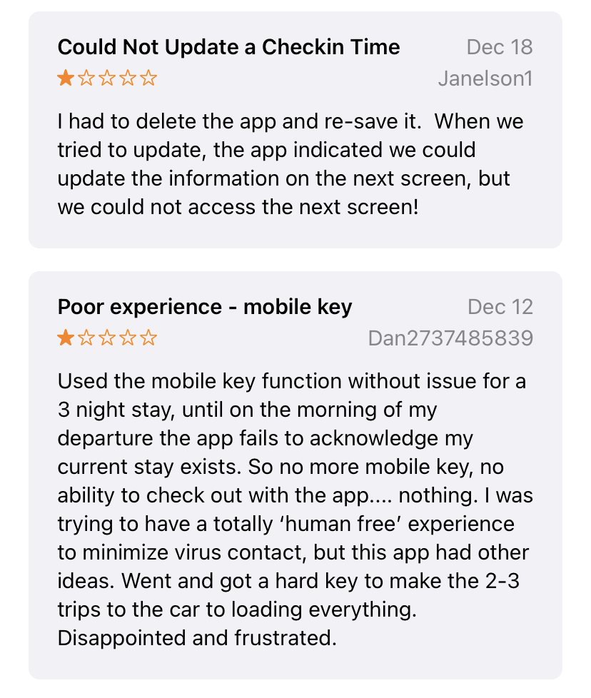
Competitive Analysis
Learning from competitors is a crucial aspect of design thinking. I downloaded many apps a in order to have a better understanding of their strengths and weaknesses; where I should get inspired and what we should avoid.
Phase 2: Ideate
Task Flow
If users encounter friction in one of the flows, there’s a chance that they’ll leave the app for good. That’s why it’s critical to optimize each and every one of the mobile user flows.
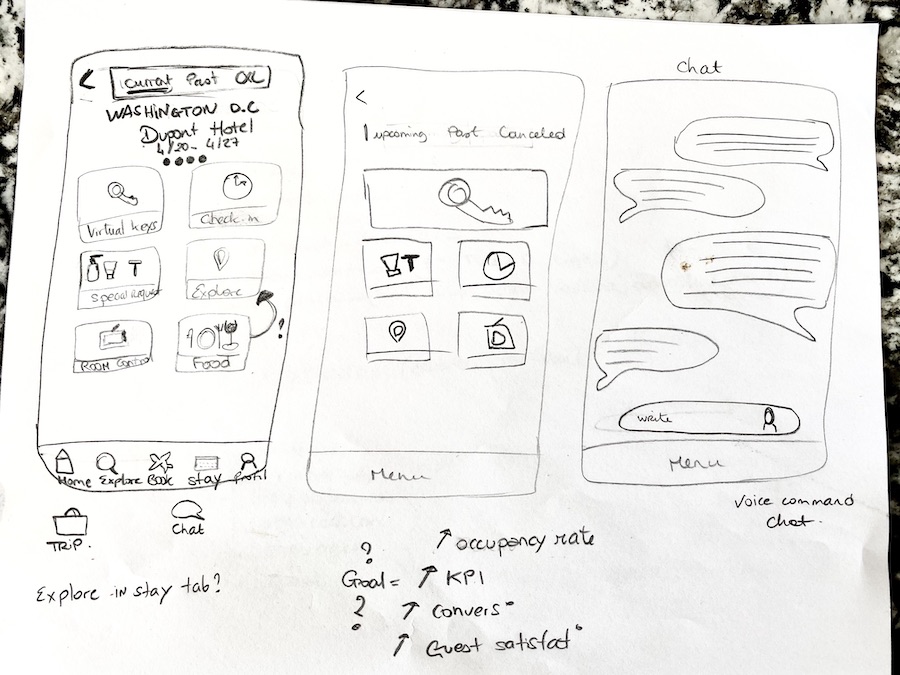
Sketches
With the goals for the app and users in mind, I started drafting some sketches to solve our user problem.
Check-in from anywhere even before arriving of the hotel
Getting key without waiting in any line
Check out without interacting with anybody
Phase 3 : decide
Brainstorming
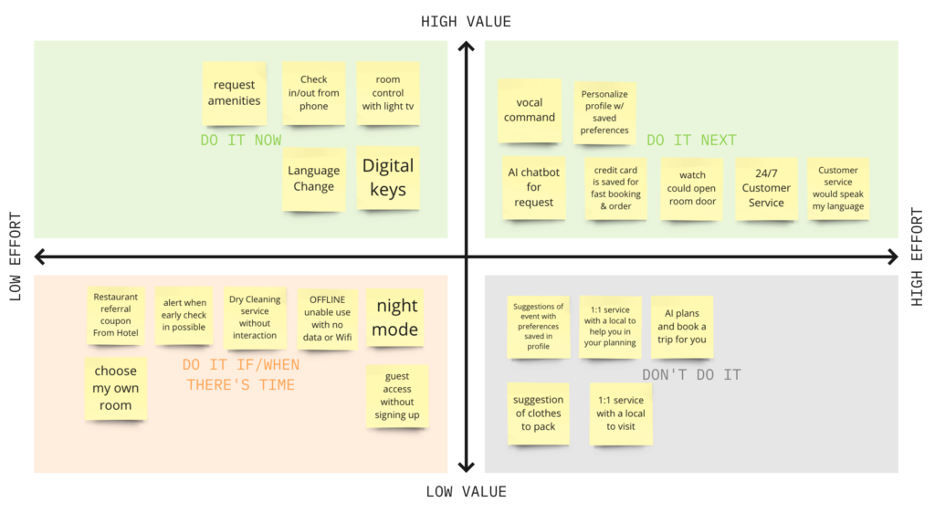
DEFINING THE MVP
In order to determine the MVP of the App, I organized my feature ideas by priority from a User and Business point of view.
This type of decision would need to include Developers to understand what is feasible on their hand to determine the amount of effort. In this particular case, I went with the assumption that they are able to implement anything. MVP is very useful to see clearly in the backlog and see what is coming up next.
The prioritization matrix focused on themes related to being time-efficient and having more personalizationcapabilities when check-in/out of an invisible service hotel.
Phase 4 : Design Prototype
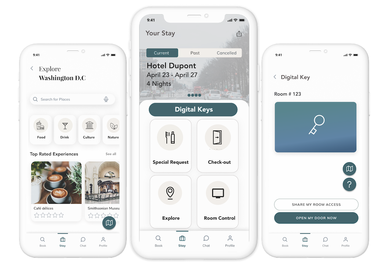
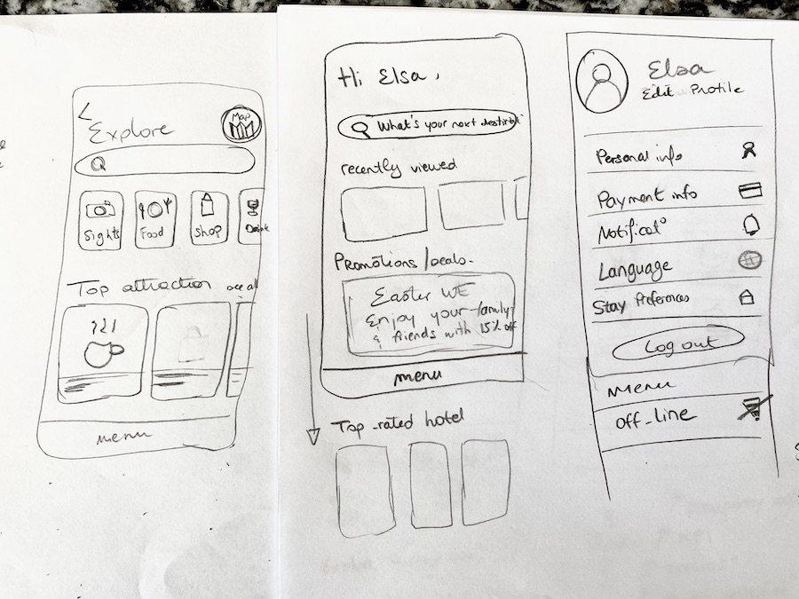
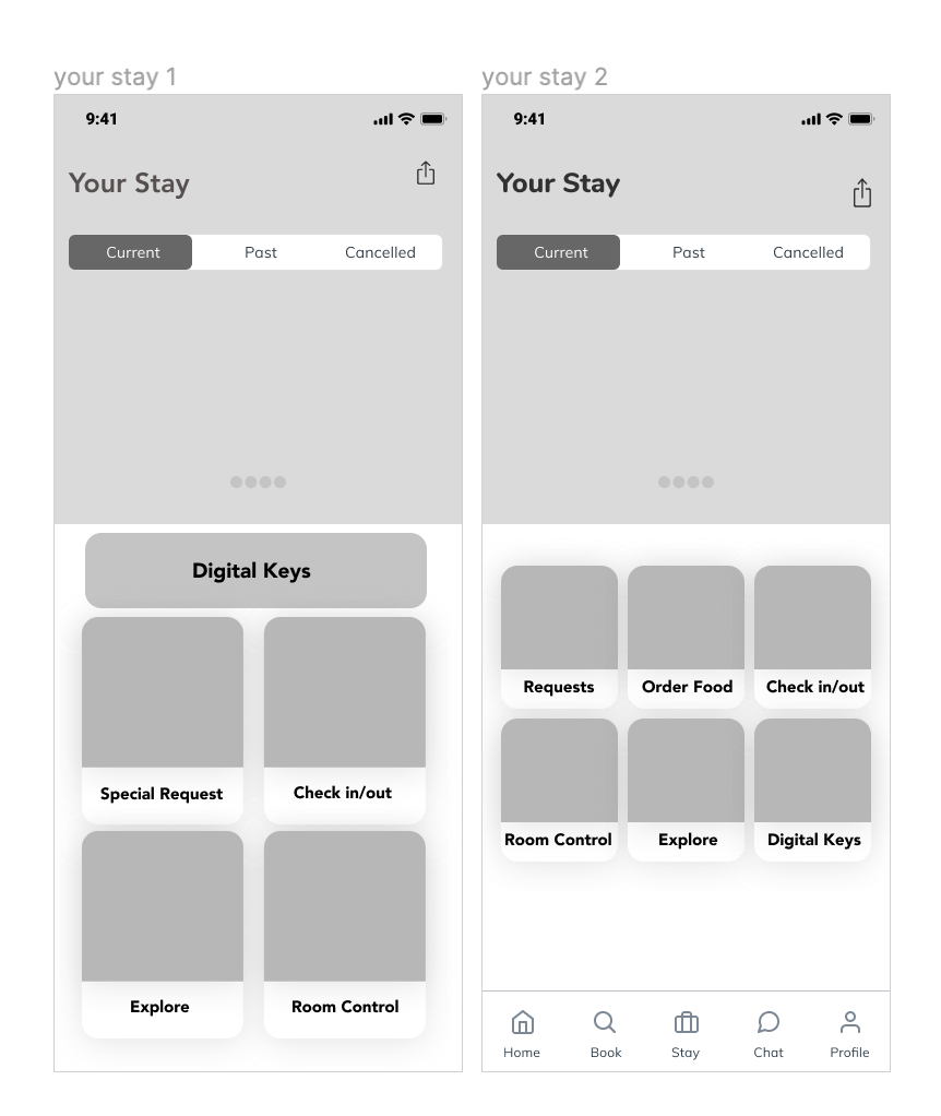
WIREFRAMES & LOW FIDELITY PROTOTYPE
Less is more. The least scrolling possible with a clean, non-cluttered, and easy interface to checkin/out and get room key from their phone.
I was not quite sure how to present the screen so I drew a couple of options and finally found a solution that would facilitate the user interaction with the product.
Phase 5: Test
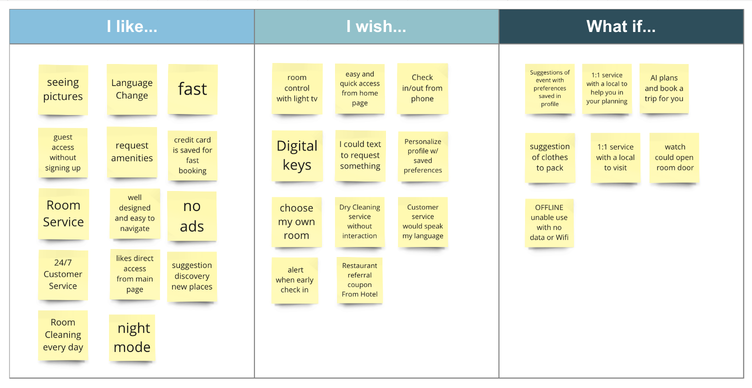
USER TESTING
Before moving to far in the dsign process, I wanted to make sure my design decisions were being understood. I realized a prototype to be able to test it with user.
Testing tasks:
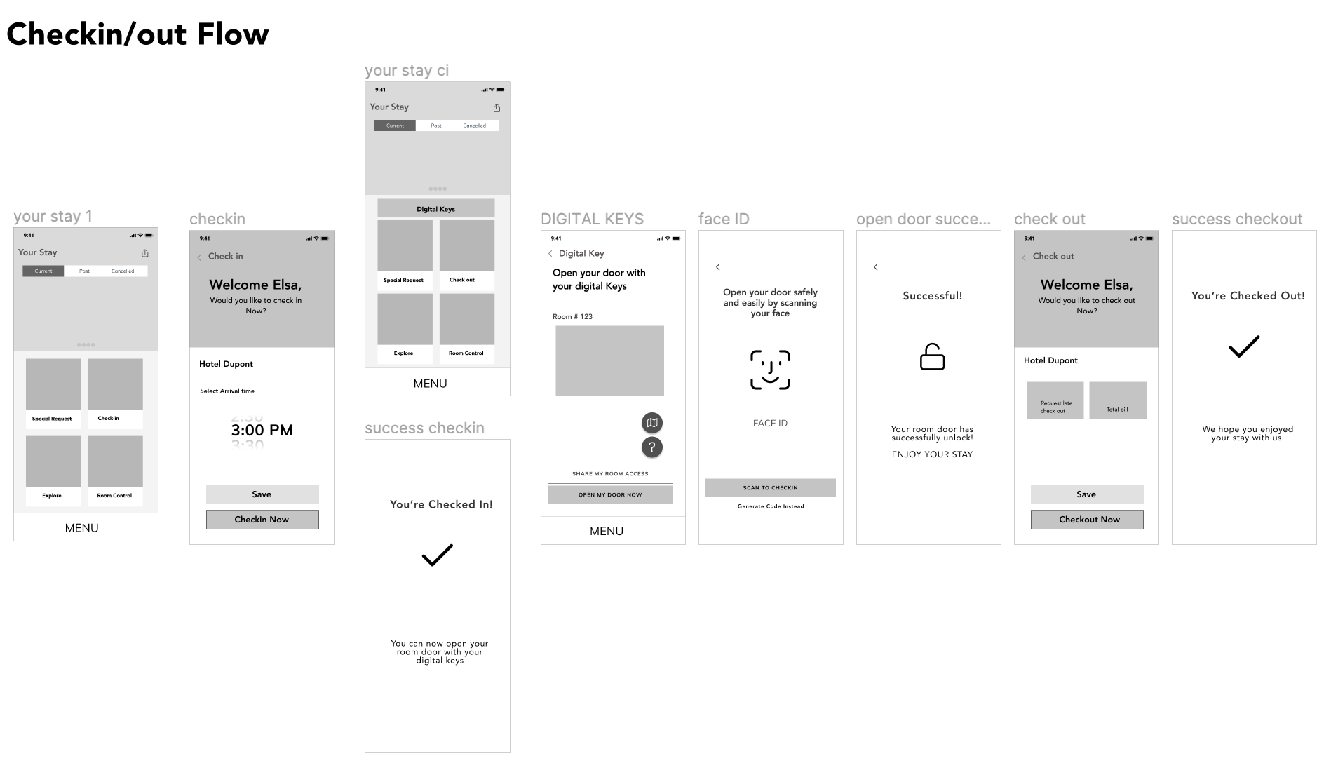
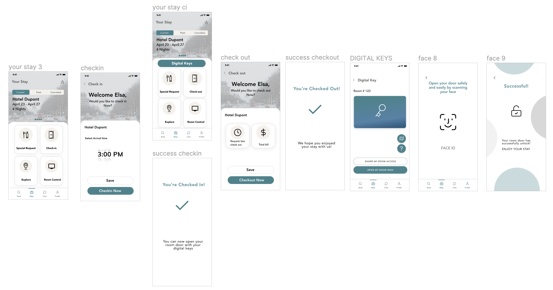
Check in to your hotel room
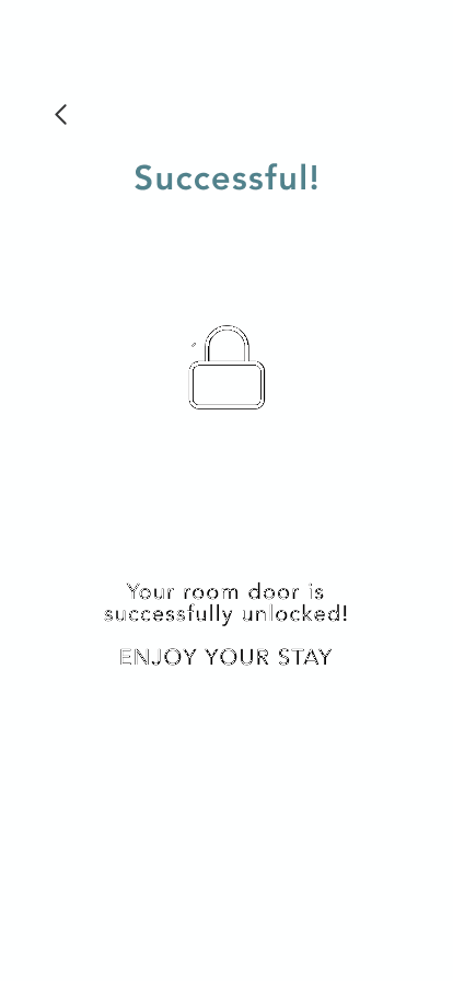
Open your door with the digital keys
Check out
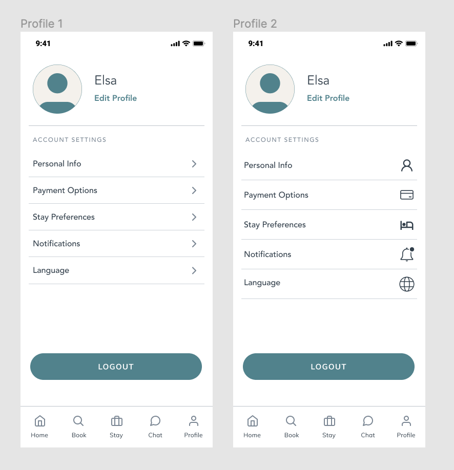
A/B TESTING: I realize some quick AB testing to validate some assumptions regarding the icons. It reduces the cognitive loads to included visual. I was fairly confident with my knowledge in this psychology study but wanted to validated to make sure. I design for people not for me.
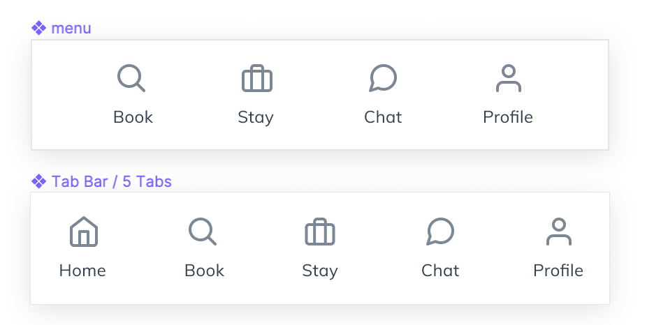
Also, my menu needed validation on which one made more sense for users.
User Testing & Key Findings
“Language feature would be very helpful when we can travel again”
Anais - Project Manager
“I can almost navigate without even looking at the words”
Andrew - Engineer
Iteration
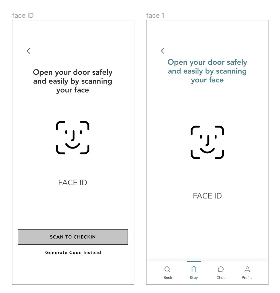
During the testing, this extra step on the scanning screen was disturbing people. They mentioned not wanted to have to click again in order to open their room but wanted to have the Face ID technology starting on its own.
I simplified my flow by getting rid of this extra step.
Bonus: UI design
Mood board
interaction
After designing the wireframes, my priority was finding a way to retain Elsa on the app and also have Elsa coming back! I wanted to make sure she could have a great experience the first time while accomplishing her goal to checkin .
With Figma, I created a few animation for our interface to give motivation to Jennifer to cook dinner with a smile on her face.
High Fidelity
High Fidelity Prototype
Key Takeaways
Next
Developing the virtual concierge desk
Check-in and open door from Apple Watch
Vocal Voice Command
Hotel map to choose or upgrade your room which would increase revenue
Challenges
No cross-team collaboration: not having the business goals or insights from the dev team was challenging. I went with my assumptions that there were no technological constraints.
Setting constraints & trade offs: I had to set limits and had to trade off a few feature in order to stay in schedule and delivered a viable product by the end of the sprint.
I enjoyed translating people’s needs to business opportunities by designing through a non-linear process, defining tangible and achievable opportunities, and iterating prototypes and tests to better understand user’s needs, in order to create innovative solutions that best fit the user and bring business value.